Helping marketplace sellers understand what they're paying for
- Company
- Carousell Group
- Timeline
- 6 months · Jun-Nov 2023
- Scope
- Product Design • Data Analysis • AB Testing
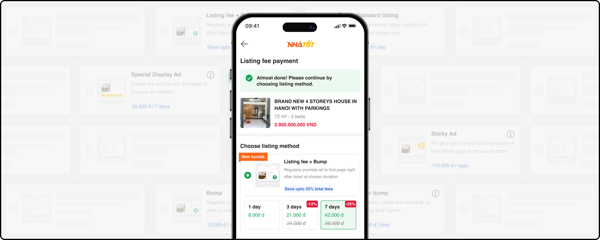
Chotot is Vietnam's marketplace for second-hand goods, vehicles, and real estate. I'm a lead designer at Nhatot, its real-estate arm, where sellers pay listing fees and paid boosts to get their ads seen.
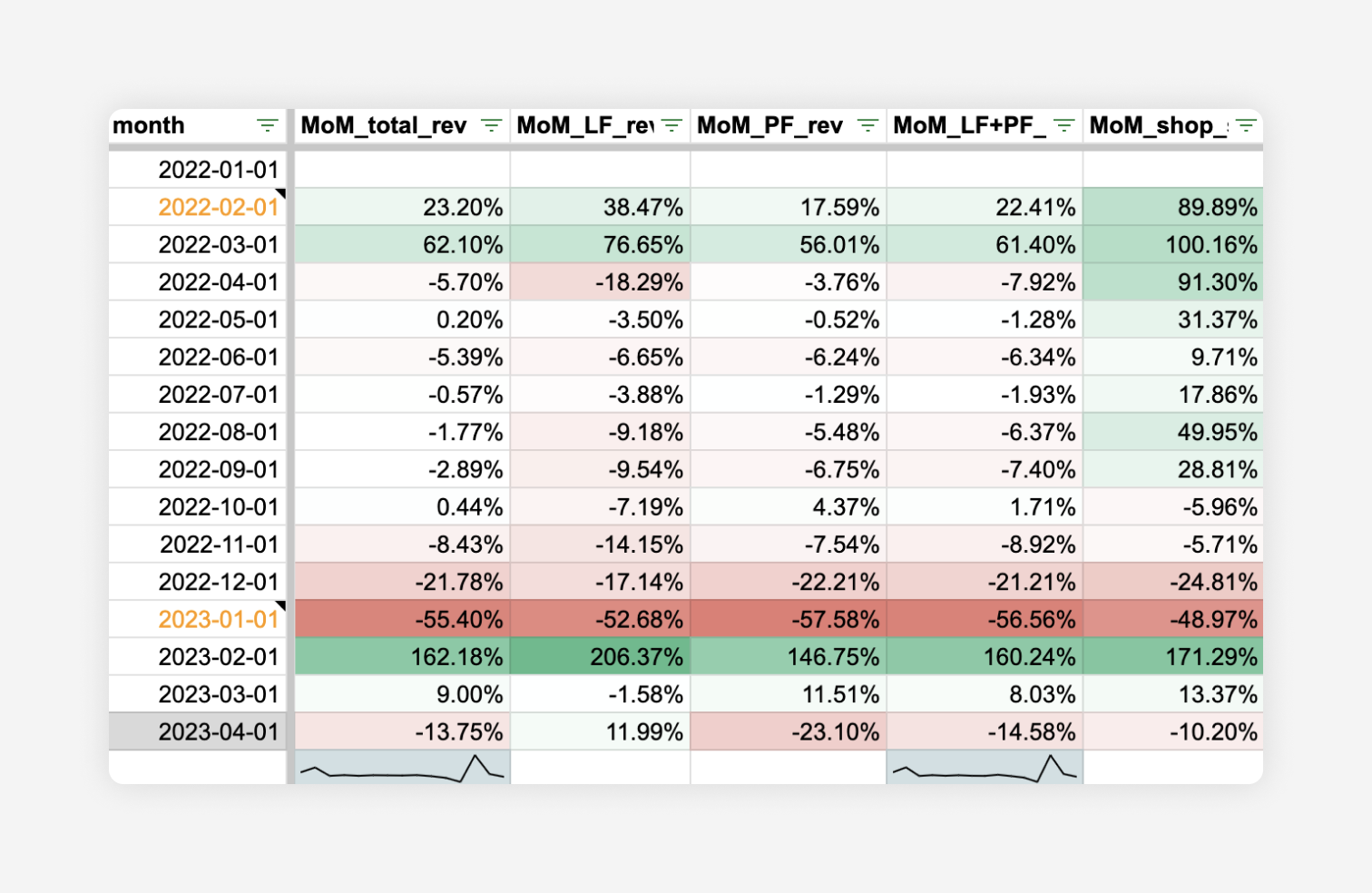
Premium features dropped worst of all - down nearly 58% - and the slide was still running when we pulled the report.
Three metrics to move:
- Conversion from service selection → payment
- New paid users (2nd listing onward - the first is free)
- Services per order
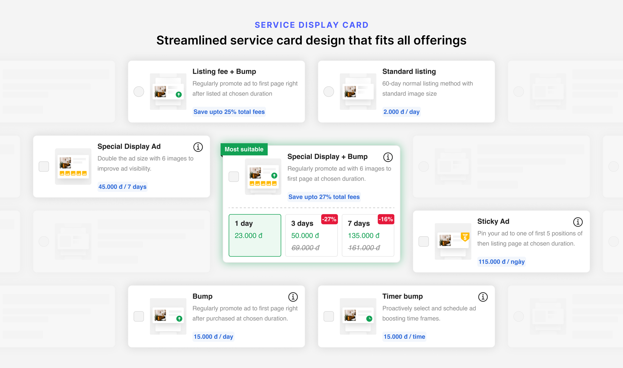
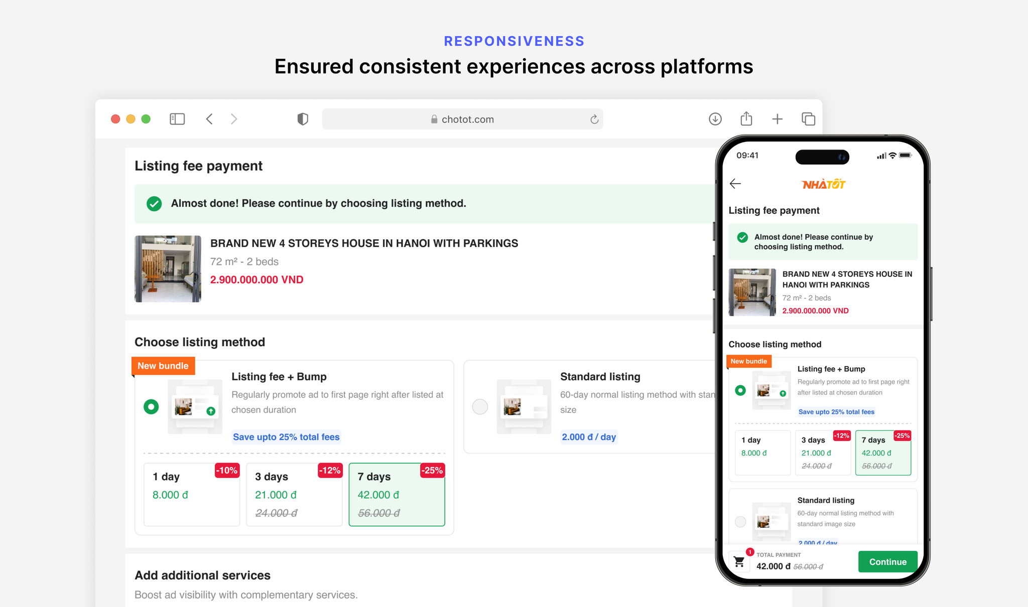
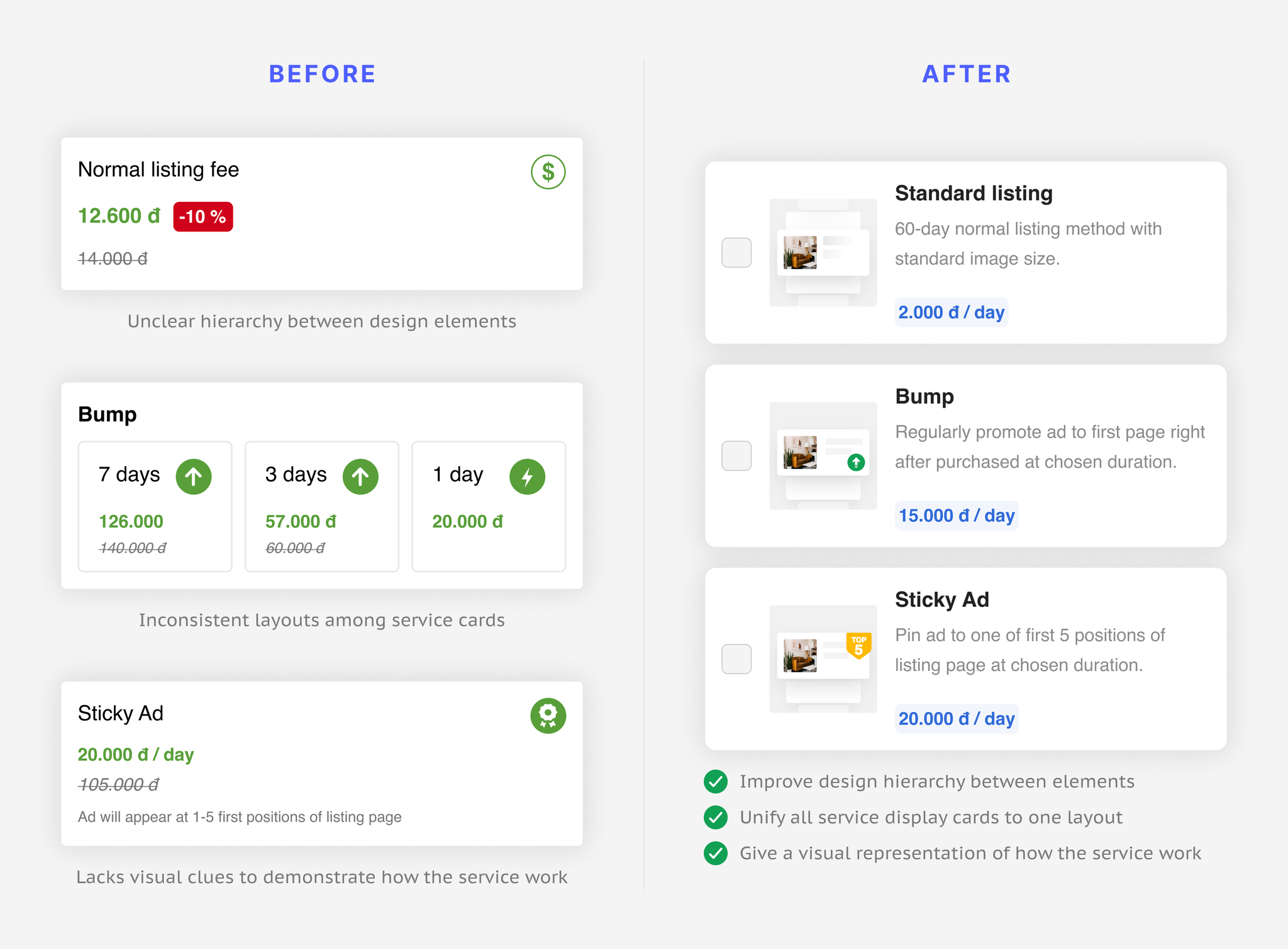
- Streamlined the service cards to cut confusion and help sellers grasp a service's value before acting.
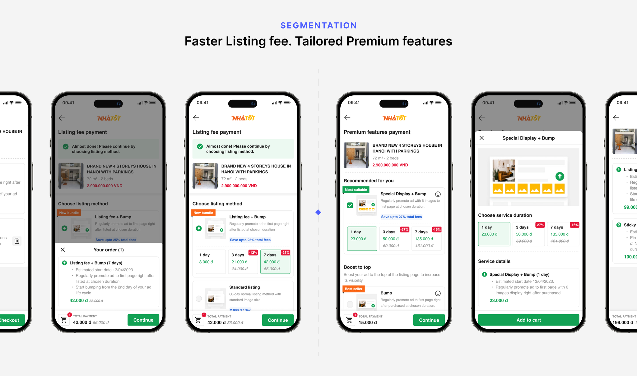
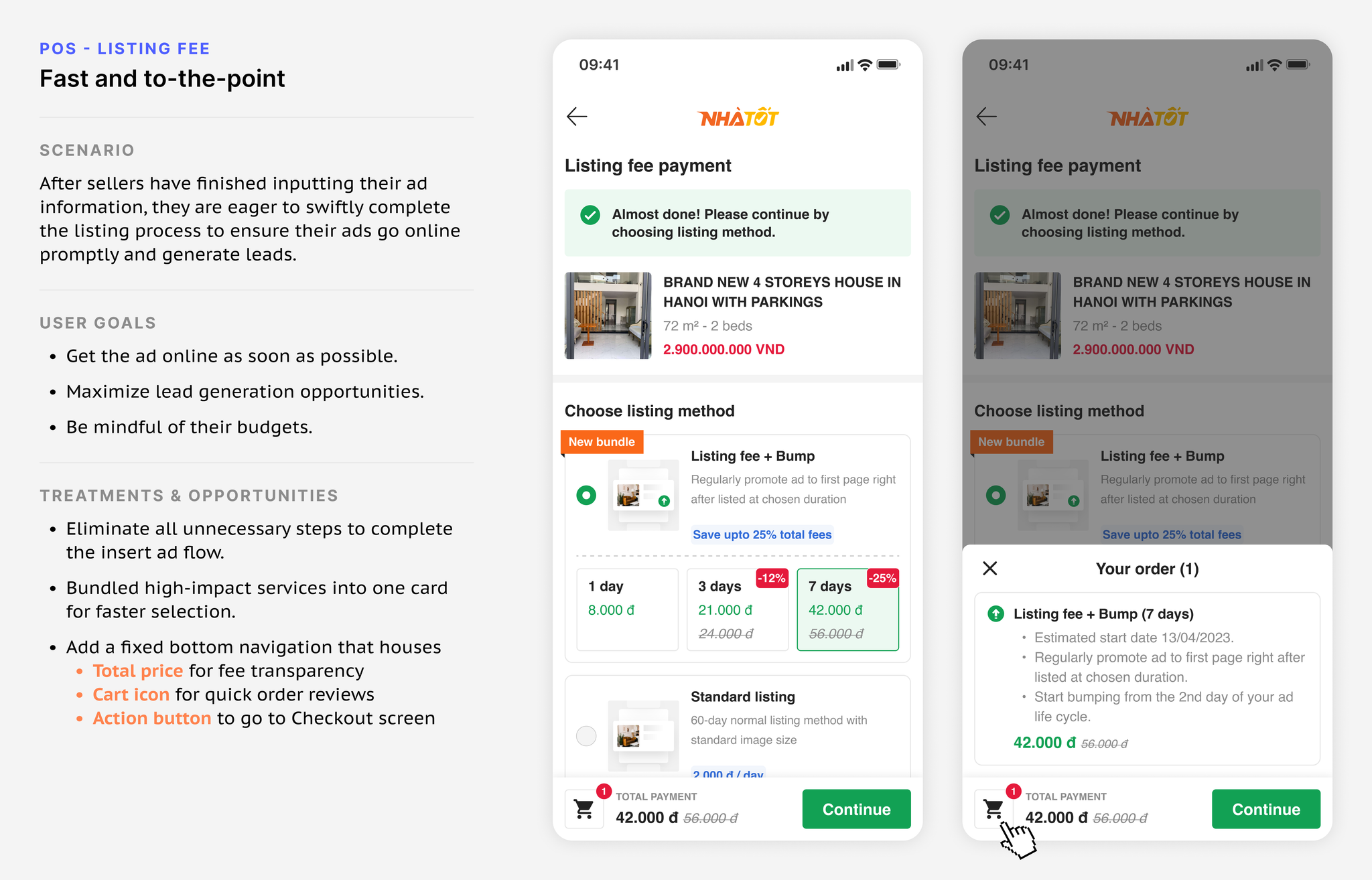
- Segmented the POS experience by journey, fully separating Listing Fee from Premium Features.
- Promoted overall usage by recommending POS Bundles for a compounded effect at a cheaper price.
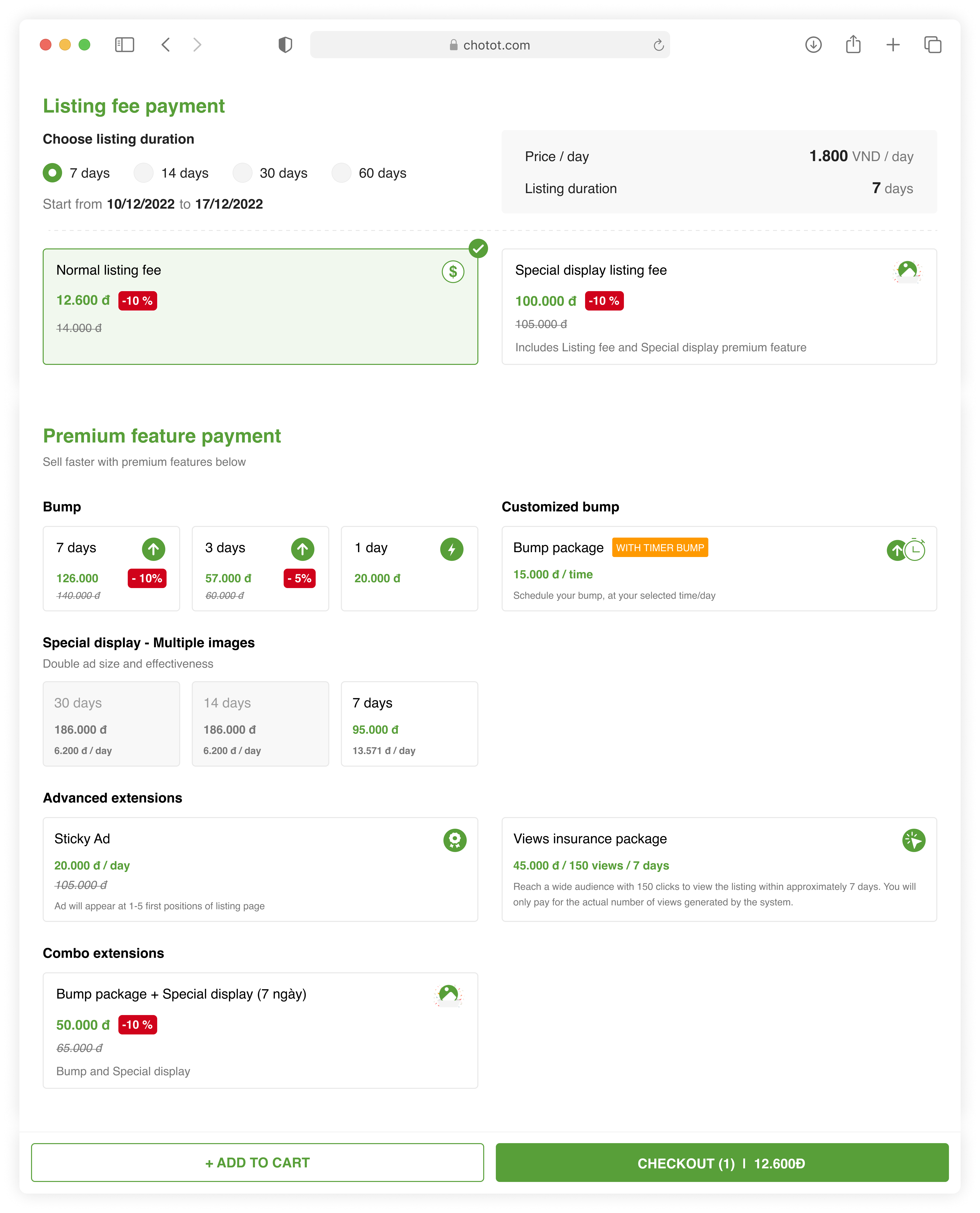
- Relevancy - too many sections that don't support the seller's need; sellers just want their ads online fast.
- Usability - multiple layouts hinder seller expectations, losing confidence to complete their actions.
- Value - few descriptions of how services help, and no scannable visuals to translate their value.
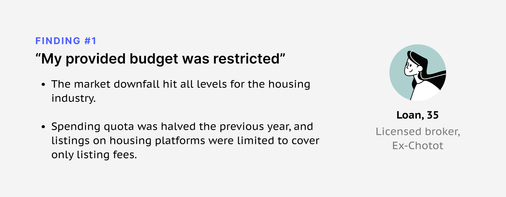
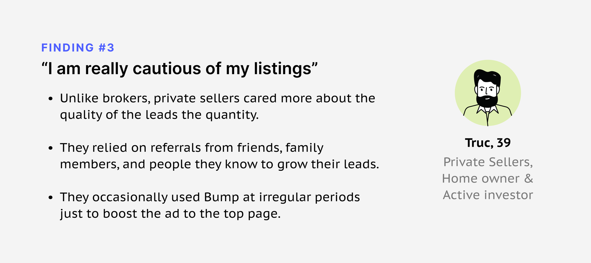
I interviewed 8 sellers - licensed brokers and private sellers. Three findings stood out:
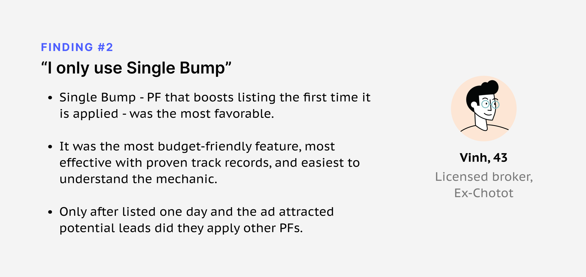
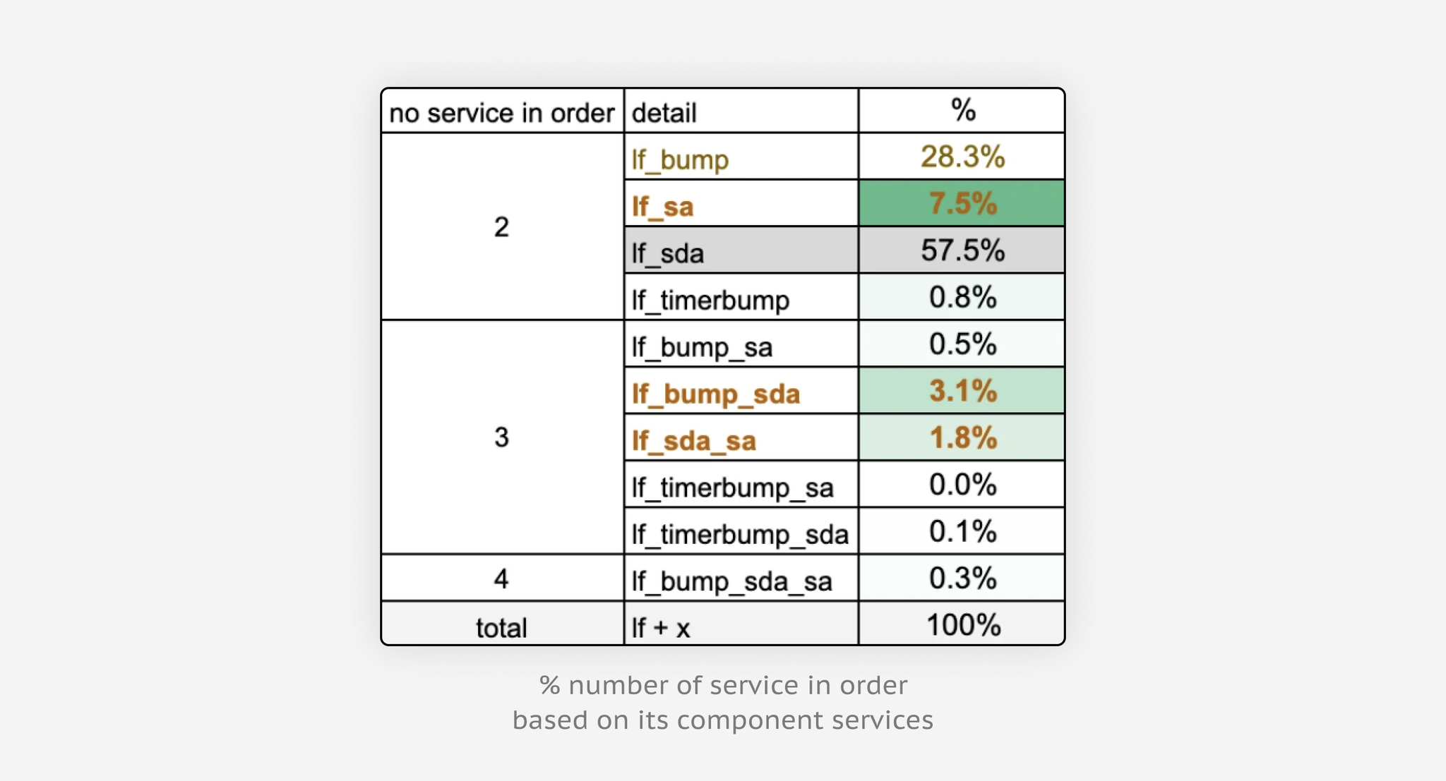
The data backed it up: 5%+ of orders already bundled multiple services, and 31% of listing-fee orders also bought Bump - pointing to an opening: upsell bundles right after listing, with Bump as the hook.
The core insight: sellers couldn't make sense of some services. So every service card now carries a name, a plain description, a price/promo, and a visual cue.
Iterating on service selection.



Splitting the flow to cut overload - listing fee at posting, premium features in the dashboard:
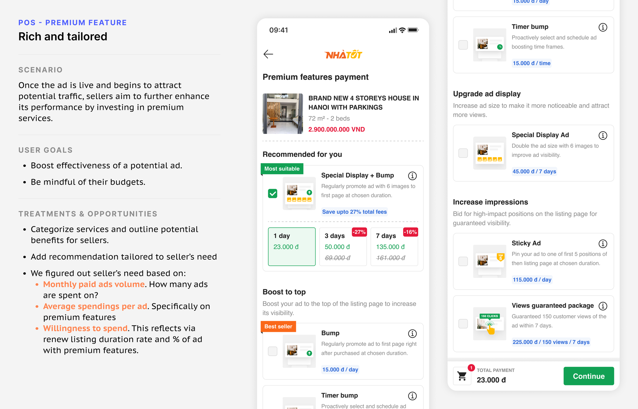
A month in, listing-fee conversion rose (39.6% → 52.9%), yet some premium features dipped. Investigating, we found two issues to address quickly:
- We'd accidentally been upselling premium features. With the old POS laying everything out at once, a fair amount of revenue came from sellers mistakenly adding services to their order - they assumed inserting the ad wouldn't complete until they'd bought something.
- Some features needed more than a text explanation. Sellers hesitated on complicated services, doubting the presumed benefit from the description alone.


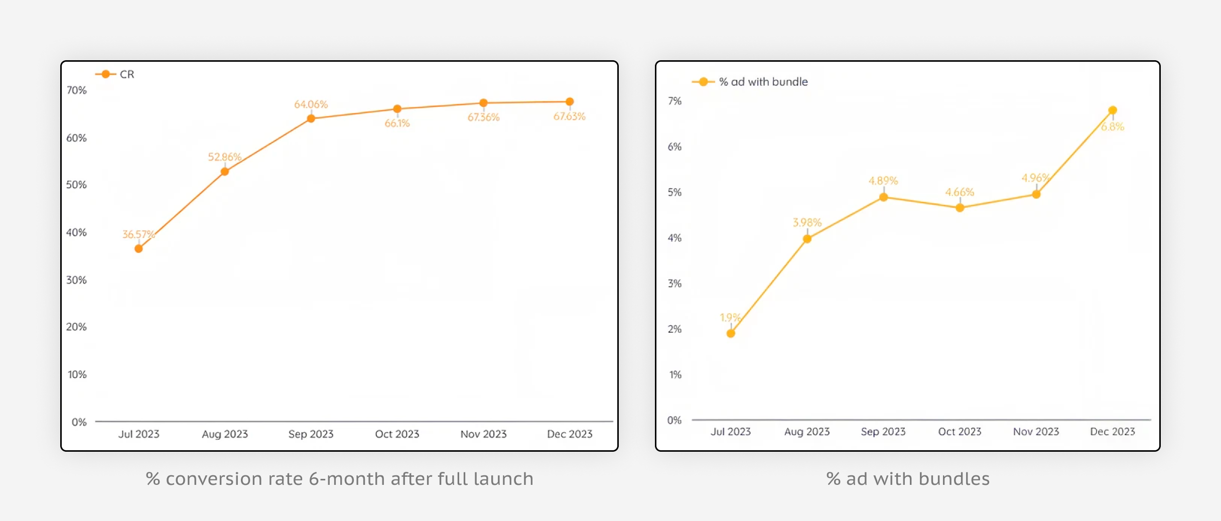
- Reached a 4.9% uplift in ads with bundles. In Phase 2 we shifted seller behaviour toward bundles by introducing more cost-effective bundles with compounded effects.
- Expanded the POS treatment to two more categories - Goods and Vehicles - on the strength of a proven record.
- Design for economy of scale. With many sub-brands, solutions for key products have to flex across use cases - doubters thought the revamp wouldn't transfer to other categories; it did.
- Owning a product line is a documentation marathon. Extending the POS to each category meant reworking offerings and edge cases, and making sure new requirements never broke live mechanics.